
Interest Only Mortgages
Nationale-Nederlanden needed a strategy to inform people about the state of their interest only mortgage. I set-up and facilitated a design sprint with a colleague designer and worked on an implementation plan based on the results.
Goal
Align teams around a shared understanding of the interest-only mortgage journey and define a clear strategy that supports customers earlier and more effectively, while making the process more efficient for the business.
Outcome
The project produced a direction and full end-to-end storyboard that aligned teams and clarified next steps. A structured handover was prepared for development, and the first implementation steps for a new tool and communication updates were set in motion.
My role
Workshop design, workshop facilition, UX design, concept development
Team
Product, content, UX, marketing, business stakeholders
Overview
Interest-only mortgages are a type of mortgage in which customers don’t make monthly repayments but only pay interest. This means that at the end of term, the customer has to either: pay the interest-only mortgage in full at once, sell the home, or apply for a new mortgage .These types of mortgages are quite unique in Europe and are subject to newer and stricter regulation from European and Dutch regulators then they once were. Due to this stricter regulation, Nationale-Nederlanden is required to more intensively serve customers with this type of mortgage.
We wanted to make the interest-only mortgage journey easier for customers so they wouldn’t face surprises at the end of their term. At the same time, we aimed to make the process more efficient for the business by identifying the biggest pain points and addressing them with the right solutions.
Context and goal
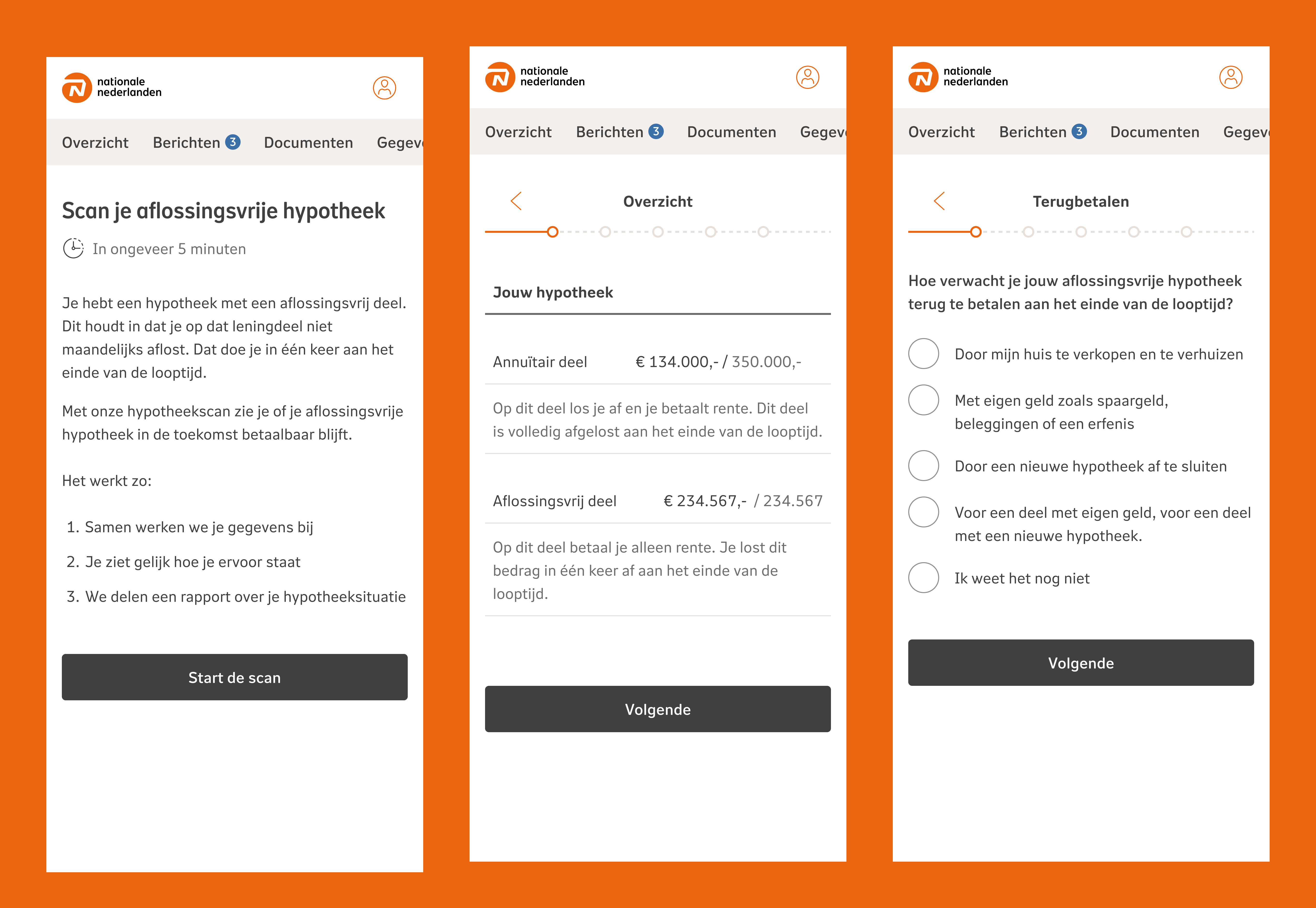
Customers with an interest-only mortgage received communication through letters and phone calls, especially those identified as high-risk. After this outreach, they were directed to an online tool where they could submit key financial details — income, pension income, and their partner’s equivalent information. Based on this data, the tool assessed whether they were at risk at the end of their mortgage term.
Internally, the process around this tool was complex. There was extensive documentation on how the company handled these customers, along with strict regulatory requirements. Before the sprint, I deep-dived into all available materials and created a structured slide deck to give the entire sprint team a shared understanding of the current situation.
We chose to kick-off this project with a design sprint because the problem space was large, unclear, and spanned multiple departments. We needed a fast, collaborative way to bring focus and uncover a direction — not just UI fixes, but a broader strategy. We adapted the classic sprint format to suit our needs, combining research synthesis, risk mapping, concept generation, and rapid validation.
From a customer perspective, our goals were clear:
- No surprises at the end of term
- Prevent people from become at risk
- Clarity about if they’re at risk
- Support with good, sensible solutions if customers are at risk
For the business, the goals were equally important:
- Collect the information required by regulators
- Assess customer risk with more accuracy
- Reduce dependence on the external call center (a major cost driver) by moving the right parts of the process into digital tooling
This project wasn’t just about improving a form — it was about reshaping how both customers and the business navigate a critical financial moment.
Design sprint
To prepare for the sprint, I reviewed all available documentation and turned it into a concise briefing deck. Together with my UX colleague, I outlined the sprint format and identified which roles needed to be involved across the department.
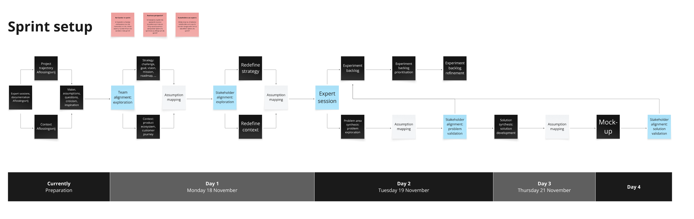
Day 1: Focus on alignment and shared understanding.
We set the overall goal for the project, mapped the customer journey, and created a product ecosystem map in two groups. We also surfaced and documented our assumptions. This ensured everyone was solving the right problems, had the same mental model of the current experience, and knew which knowledge gaps required deeper research during or after the sprint.
Day 2: Align with business stakeholders.
We presented our synthesis, validated or adjusted our understanding, and clarified constraints from regulatory, operational, and financial perspectives. With this context aligned, we were able to refine the overarching strategy and prioritise the most important problems to solve first.
Day 3: Shift from understanding to problem-solving.
We started by taking the highest-priority issues and using the 5 Whys method to uncover what was actually driving them. This helped us move past surface-level symptoms and identify the underlying causes that needed attention. We clustered these insights to make patterns visible and to ensure the team was aligned on which root problems mattered most.
Day 4, Converged on the strongest direction.
We reviewed all ideas and voted on the most promising elements. Rather than selecting a single solution, we combined the best pieces into a cohesive overarching concept. With this foundation in place, we continued with a focused ideation session. Instead of open-ended brainstorming, we guided participants to generate ideas specifically targeted at the root causes we had identified. This kept the session productive and ensured that every concept was tied to a real user or business problem.
Following up after the design sprint
Following the sprint, I developed this direction further by creating detailed storyboards and concept mockups. These helped articulate how the experience could work end-to-end and which touchpoints should be redesign or which touchpoints should be created. This storyboard let stakeholders understand the vision and helped discuss trade-offs.
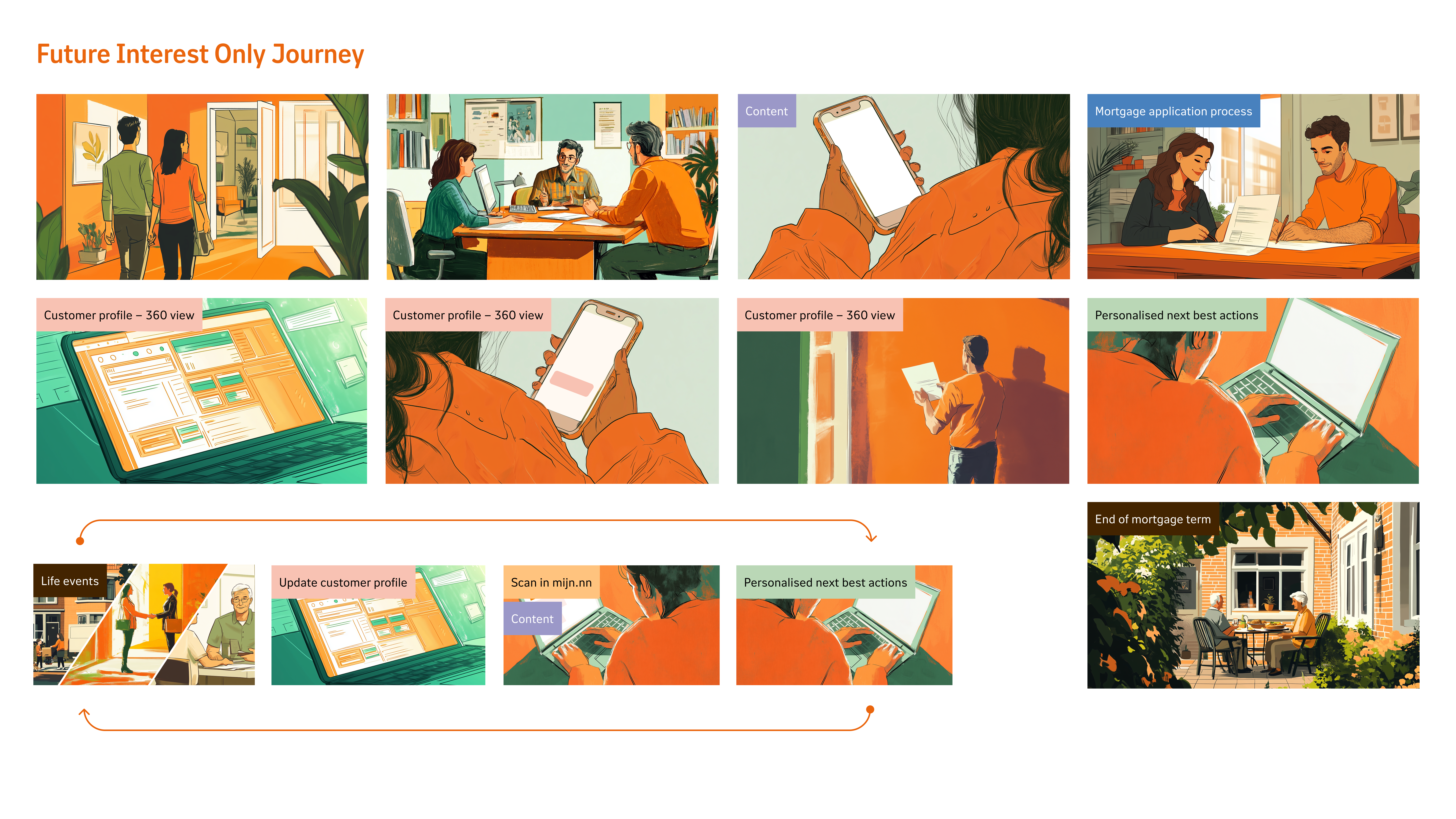
After presenting the storyboard and aligning with stakeholders, the first concrete step was to design a new digital tool that would help customers understand their risk, outline their repayment plan, and explore possible next steps. My UX colleague took the lead on shaping the full end-to-end experience, while I supported with feedback, design guidance, and several key screens.
Once the flow was complete, we prepared the designs for handover to the development team, ensuring requirements, interactions, and assumptions were clearly documented. In parallel, our content and communication teams improved the letters, emails, and call scripts customers received, so the entire journey — not just the tool — became clearer and more consistent.
Closing thoughts
This project brought clarity to a complex and highly regulated part of the mortgage journey. By aligning people and teams, reframing the problem, and defining a clear direction, we created a more supportive experience for customers while giving the business a solid foundation to build on.