Improvements to the Woningcheck
By combining a few key details from the homeowner with external housing data, the Woningcheck generates a personalized set of sustainable measures, expected savings, and a clear next step: scheduling an appointment with a sustainability expert. I executed research and identified problems with the Woningcheck for different user groups. I designed and guided implementation of improvements which increased the amount of customers and customer satisfaction.
Goal
Improve the Woningcheck so more homeowners feel confident to book a call with a sustainability expert — ultimately increasing sustainable installations through Powerly.
Outcome
A clearer, more accurate Woningcheck led to higher conversion, more expert calls, and a stronger foundation for ongoing improvements.
My role
Research, UX design, concept development, implementation guidance.
Team
Product manager, developers, sustainability experts, marketing.
Powerly helped homeowners understand what sustainable measures could do for their home and helped guide the process of installing sustainable measures. The Woningcheck was a critical first step.
By combining a few key details from the homeowner with external housing data, the Woningcheck generates a personalized set of sustainable measures, expected savings, and a clear next step: scheduling an appointment with a sustainability expert.
Understanding homeowners
Homeowners came to Powerly with different levels of knowledge. Through interviews, usability testing and analytics, I identified key groups:
Homeowners that are new to sustainability
Characteristics:
- Unsure about their home details (energy label, insulation, etc.)
- Want to understand potential savings and comfort improvements
- Not familiar with terminology
Needs:
- “Can I save on my energy bill by installing sustainable measures?”
- “What measures exist?”
- “What is realistic for my home?”
Homeowners researching specific measures
Usually solar panels or a heatpump.
Needs:
- Is this technically possible for my home?
- Is this financially wise?
- Which companies can install it?
- What would the timeline and next steps look like?
Despite differences, every user needed personalized, trustworthy guidance. Not generic advice.
Business
The woningcheck was an important touchpoint homeowners had with Powerly. After getting an overview of the possibilities, people could create an appoinment for a phone call. In this phone call they would discuss the results of the check and next steps with one of our sustainability experts.
Better Woningcheck experience → More appointments → More homeowners speaking to experts → More sustainable installations → More revenue + impact.
What I did
- Identified types of homeowners visiting Powerly through various types of research: interviews, usability testing, concept testing.
- Designed improvements for the Woningcheck that better served our customers and connected more homeowners to our sustainability experts.
- Did a technical deep dive with our developers to explore possibilities and guided the implementation of improvements.
- Designed concepts for long term, to explore and test what the user experience of the Woningcheck could be like.
- Gathered information on the current state and set up new ways of measuring a succesful user experience. Through analytics, Hotjar, on site feedback tools (like Usabilla).
Key improvements
- Made the result of the woningcheck easier to interpret, and made it clearer to the user what the next step in the Powerly process was. This made the benefits of installing sustainable measures more clear, showed the user how to do it with us and made them more inclined to create an appointment with our experts. Especially important to our homeowners new to sustainable measures.
- Made the advice more accurate and more detailed. If the result was not accurate or too superficial, users didn’t get answers to the questions they had and wouldn’t trust us. Especially for users that already knew more about their home and the possibilities for sustainable measures.
- (To ensure we could keep growing) A solid technical and UI foundation so we could start experimenting with different features and experiences.
Show me the money – some examples
Form step - Additional details
In order to create a more accurate advice, we need certain input from our user. This creates a dilemma, because there is a group of people that is still new to sustainability measures and all the terminology around it.
To strike a balance between the different levels of knowledge, we tried to pre-fill as much as possible. In this case, if the user didn't change anything, we'd still get a relatively accurate reading.
Some fields - like the thickness of insulation - are difficult to answer even for more knowledgable homeowners. The input and format of these parameters were dictated by the API we used to get a result. This was a problem I and the team didn't have a solve for yet.

Energy costs

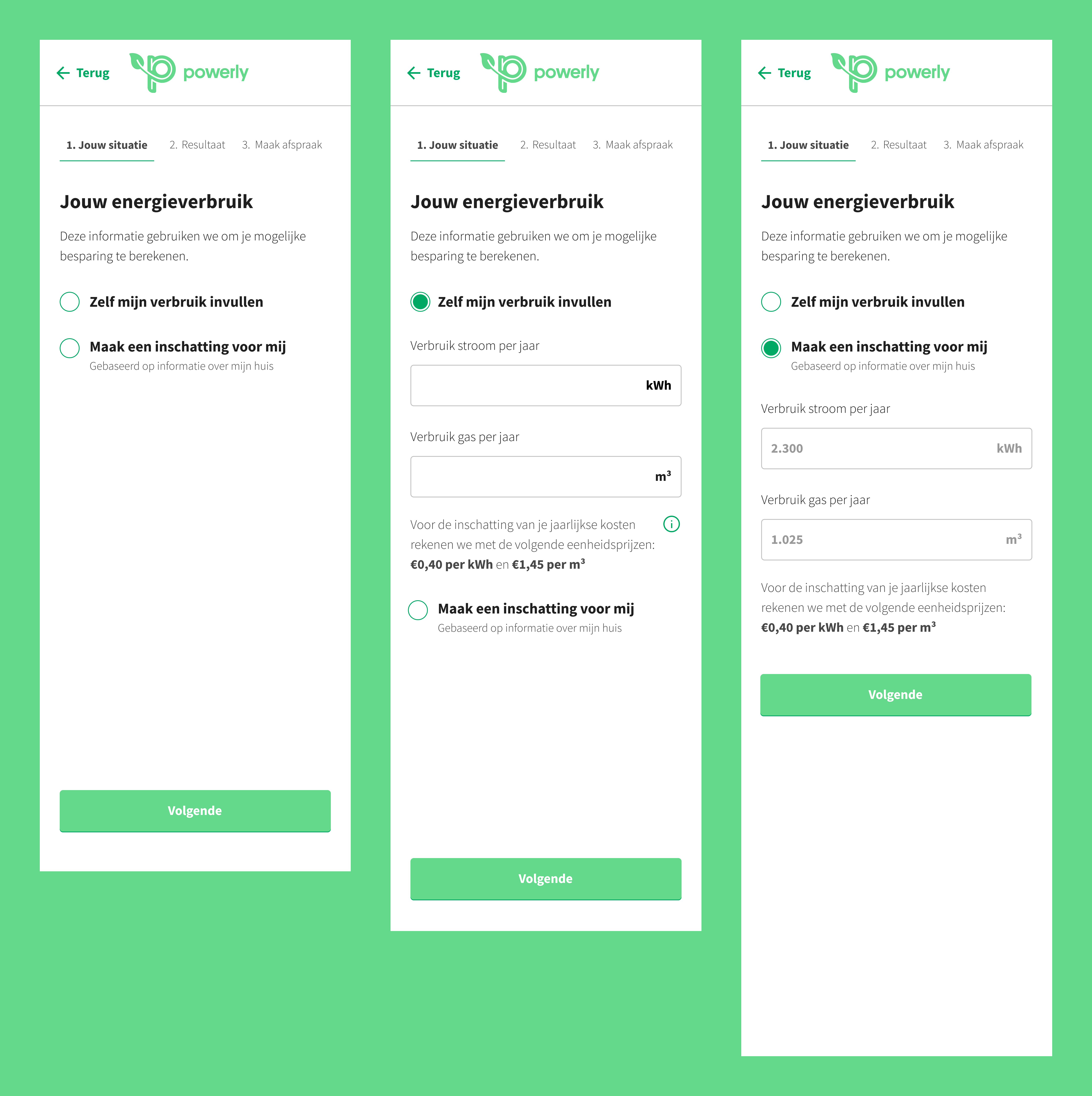
To calculate an accurate estimation on how much money someone could save by installing sustainable measures and using less gas and electricity, we needed to know how much gas and electricity someone uses now. This is why we offer the option for people to input these values.
Not everybody - almost no one - knows approximately how much electricity and gas they use on a yearly basis. This is something users have to look up in the app/on the website of their utility company.
But we also didn’t want users to leave this empty, since this would lead to inaccurate results. This is why we added the option that let the user make them an estimate. This would be based on their input on the previous step, Less accurate then when users would look up and fill in these values themselves, but enough for people to get a good result. Especially for people new to sustainable measures, who want to feel out their possibilities, this was a valuable addition.
Results step
On this result page the most important piece is the summary. In this element the user gets a succinct summary of what installing sustainable measures will do for them. From research it became apparent that the most important driver for installing sustainable measures is monetary gain. So this is what we're leading with. How much do these measure save you per year, what is the initial cost, and what does this do to the value of your home. In this element I added a clear button to plan an appointment. We tell the users what the benefit is of making that appointment. With this approach I connected the future state to an action the user can take now.
Underneath this summary we explain which sustainable measures create the the sum of savings. There are a couple of design choices I made to support different needs.
- During usability testing I observed a pattern of homeowners not knowing where to start. They were questioning what to do first and were intimidated by the amount of sustainable measures shown. Based on best practices of making a home more sustainable, I structured the results on which steps to take first.
- Add short explainer video for people not familiar with a specific measure.
- For people interested in a specific measure added the ability to request a quote from a partner company directly.

Create an appointment

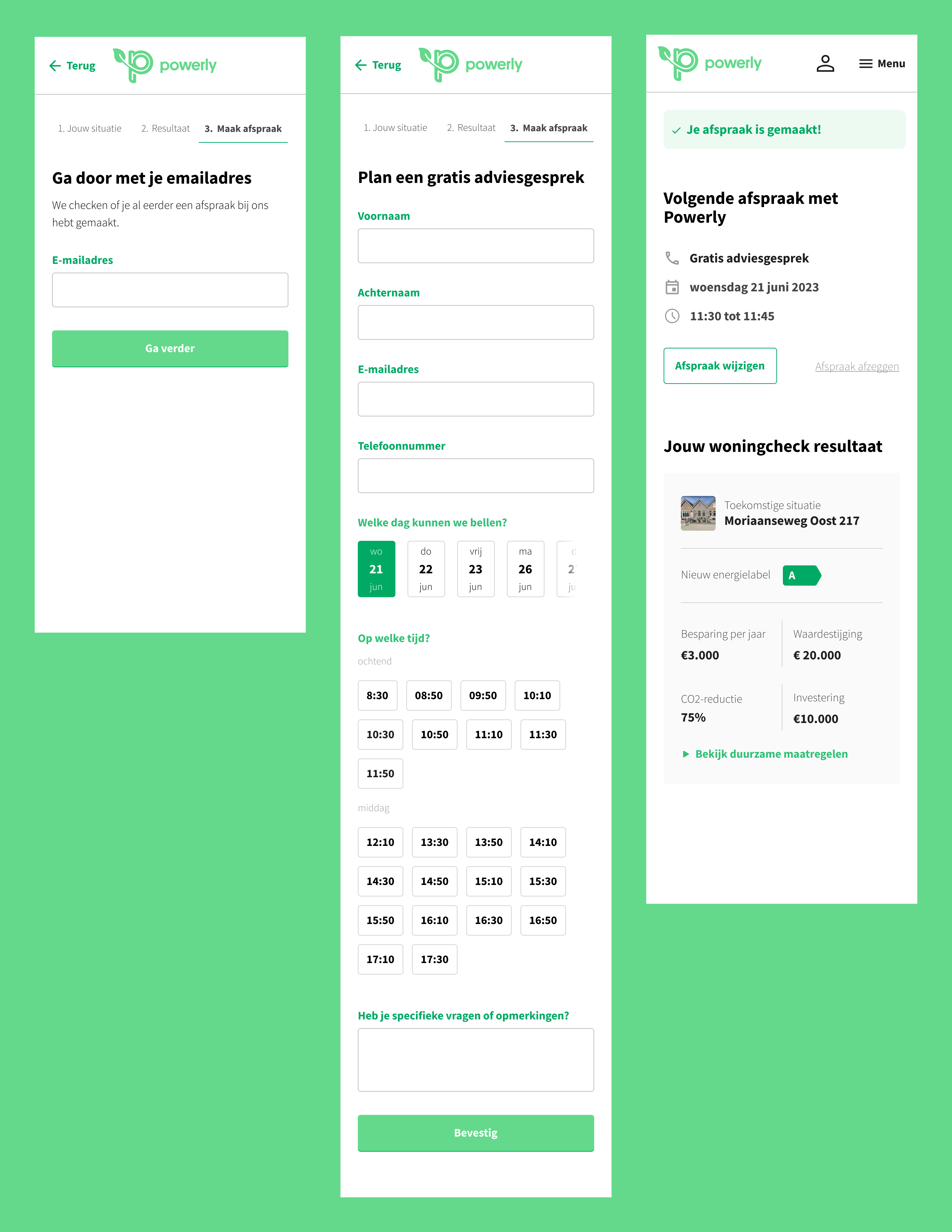
When a homeowner is ready to move forward, scheduling an appointment with a sustainability expert should feel simple and straightforward. I designed this part of the flow to have little friction and make each input and step feel necessary.
-
Email lookup to simplify the form
The flow begins with entering an email address. This helps us check whether we already know the customer. For example, if they previously booked a call or explored options earlier. If we already have their information, the next step becomes shorter. If not, they still move through the flow quickly. Either way, it’s one small step that helps keep the form lightweight. -
A faster way to choose a date and time
Most appointments took place within a week, and users wanted to follow up while the topic was still fresh. Instead of a typical calendar, I surfaced the next few working days right away. For times, I grouped availability into “morning” and “afternoon” slots. This made it quicker and more intuitive for people to match the call to their own schedule. -
A clear confirmation and easy access later
After booking, users landed on a concise summary of everything they just completed: their results, the appointment date and time, and what to expect from the call. We also sent a link via email so they could revisit or reschedule their appointment with one click.
Closing thoughts
The improvements in the Woningcheck created a clearer path for homeowners while giving the business a stronger foundation to build on. With a more structured flow, more accurate advice, and a smoother handover to experts, Powerly could better support users today and experiment more easily with new ideas tomorrow.